Isaac Julien Exhibition Branding
Branding, Print Design

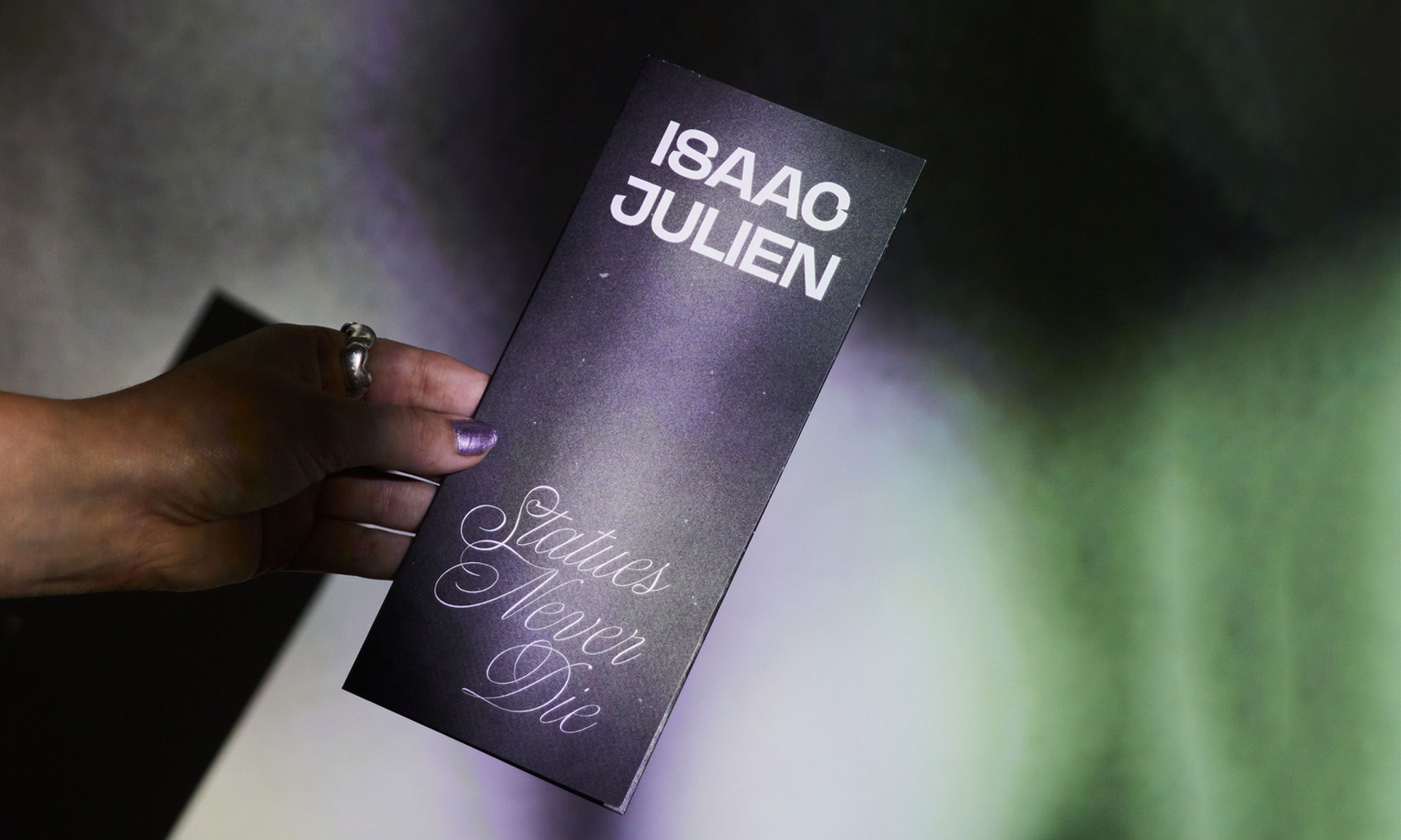
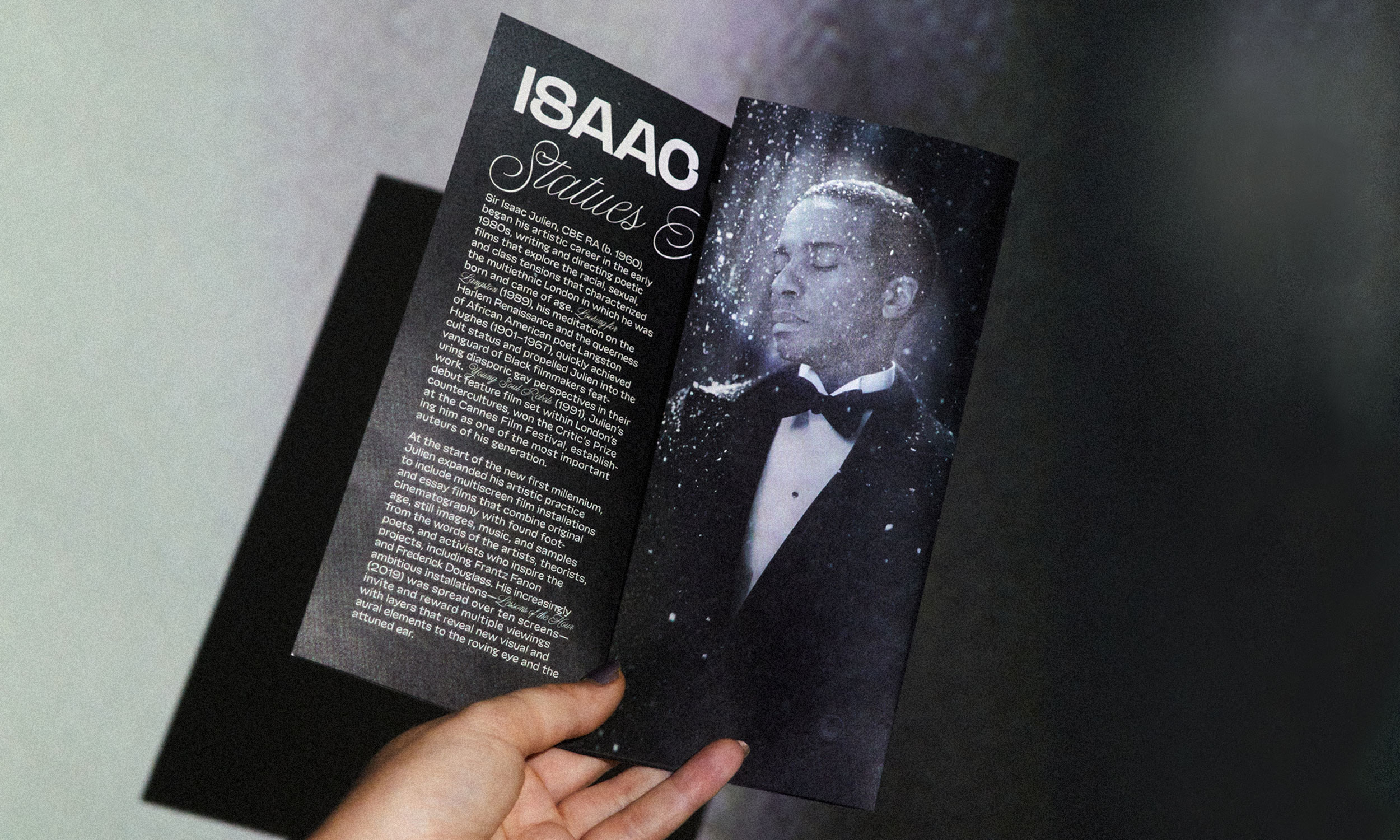

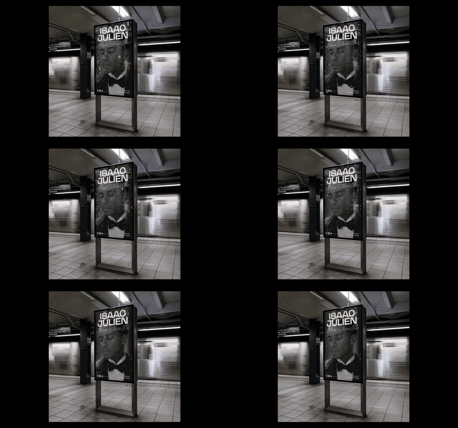
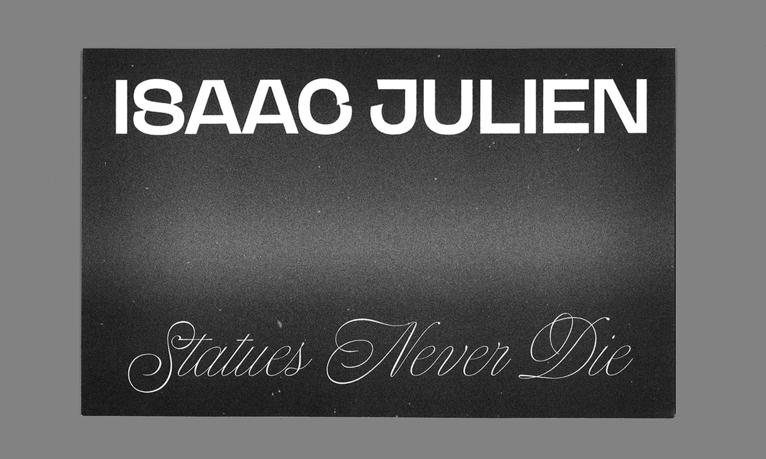
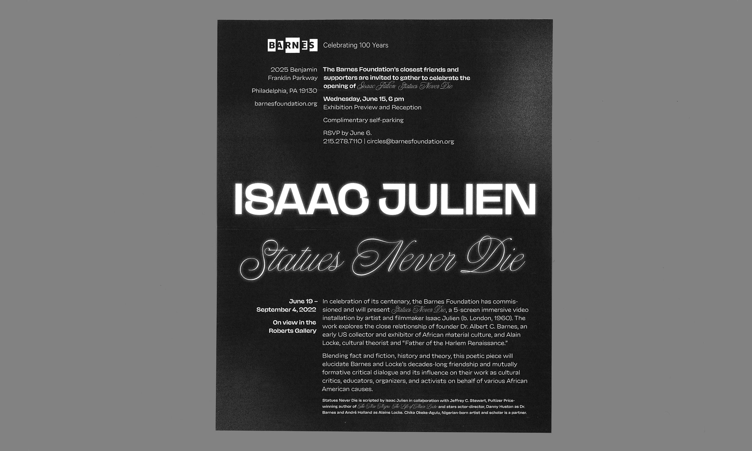
Branding, invitation suite, and brochure for exhibition Isaac Julien: Statues Never Die at the Barnes Foundation. This show was an immersive, five-screen video installation exploring the relationship between Dr. Albert Barnes and Alain Locke.
Art Direction: Olivia Verdugo
Photography: Alexander Rotundo Typefaces: NaN Jaune by Studio Triple and Nautica by Resistenza
Art Direction: Olivia Verdugo
Photography: Alexander Rotundo Typefaces: NaN Jaune by Studio Triple and Nautica by Resistenza
.
Moore Vintage Branding
Identity design


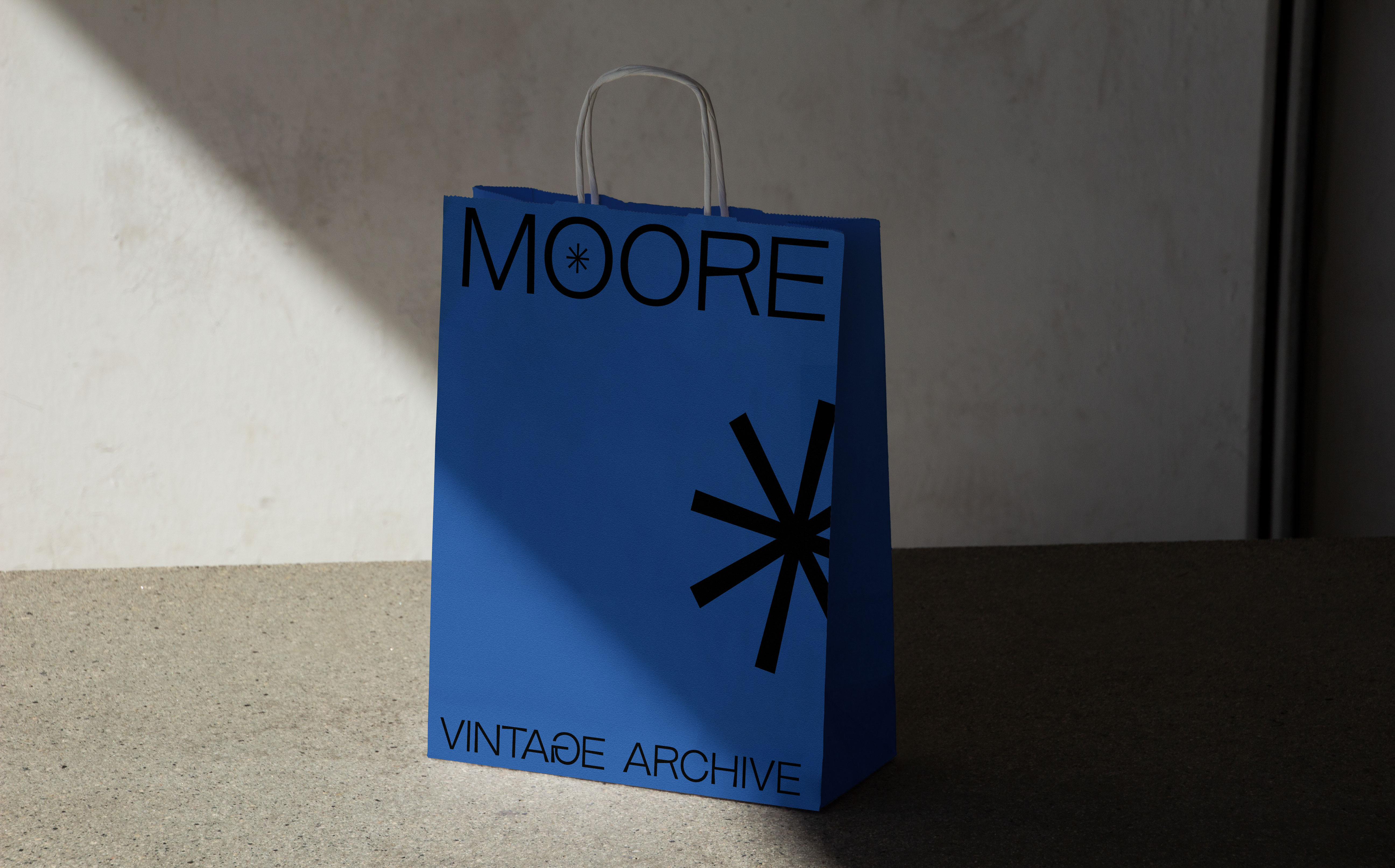


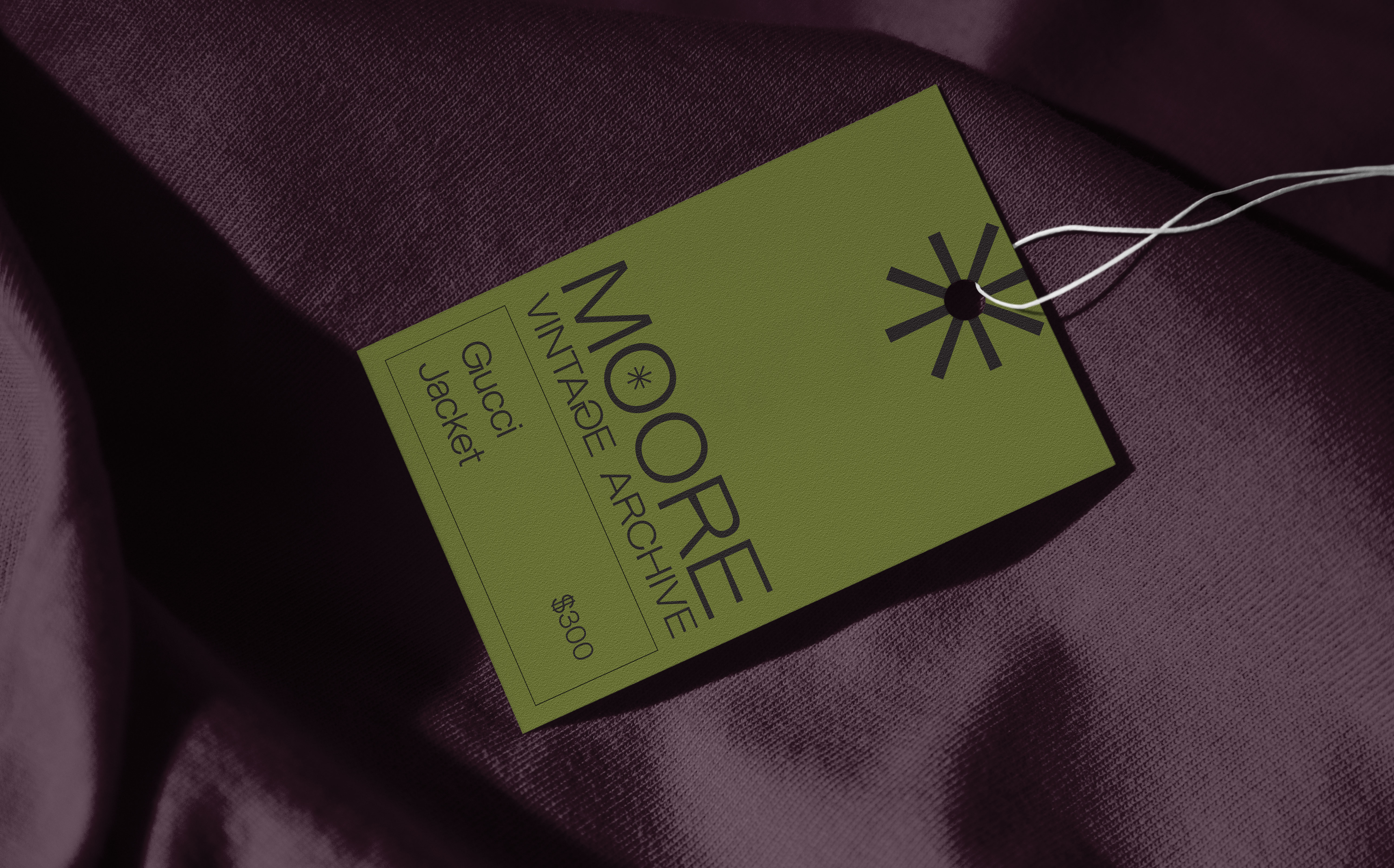
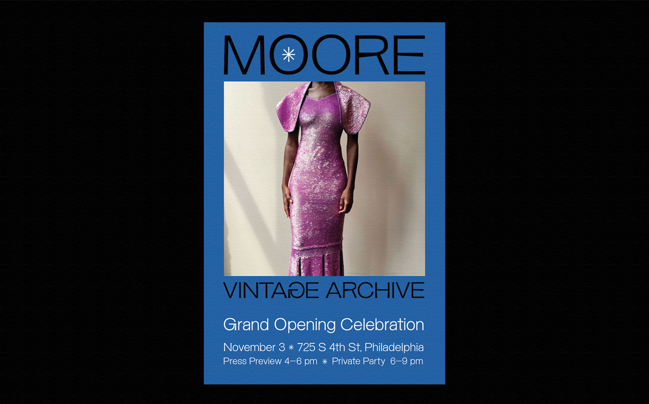
Identity for a luxury vintage brand in Philadelphia.
.
Barnes Art Ball 2021
Branding, Print Design
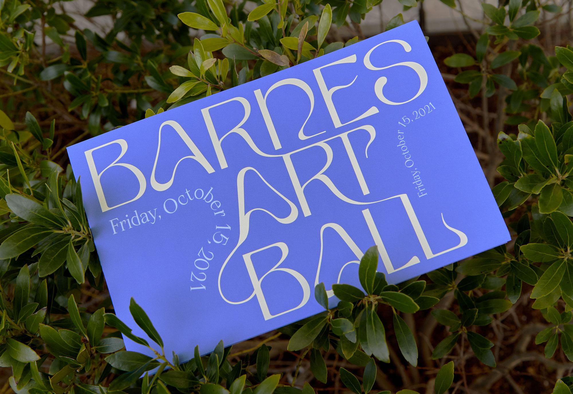


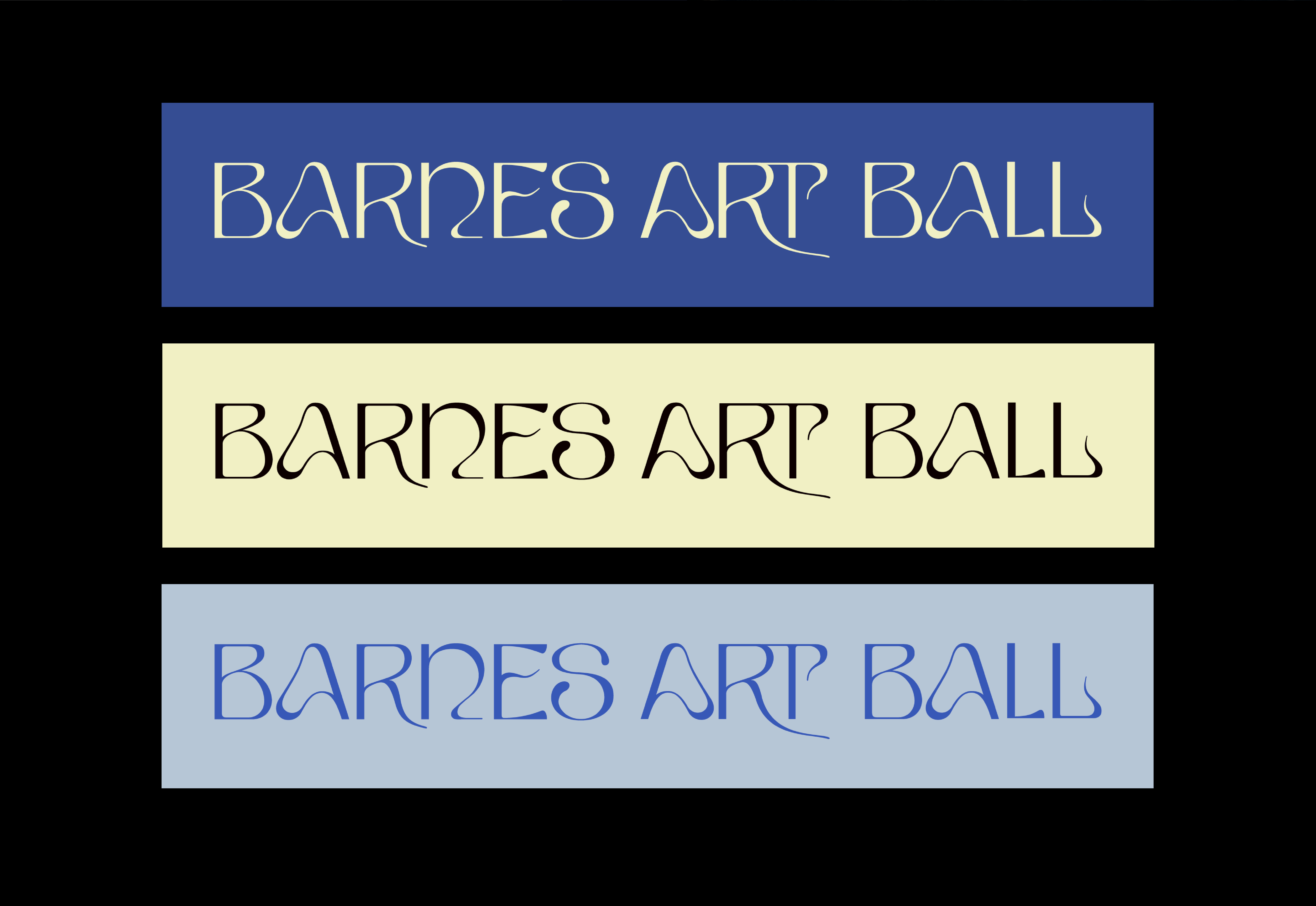

Branding and invitation suite for an annual donor gala, coinciding with the opening of Suzanne Valadon exhibition. Custom logotype created using Tenebras by Type Department. The vines in the Valadon painting served as inspiration for the logotype as well as the curvy tendrils.
Art Direction: Olivia Verdugo
Photography: Alexander Rotundo
Art Direction: Olivia Verdugo
Photography: Alexander Rotundo
.
HOTHOUSE
Branding, Print Design

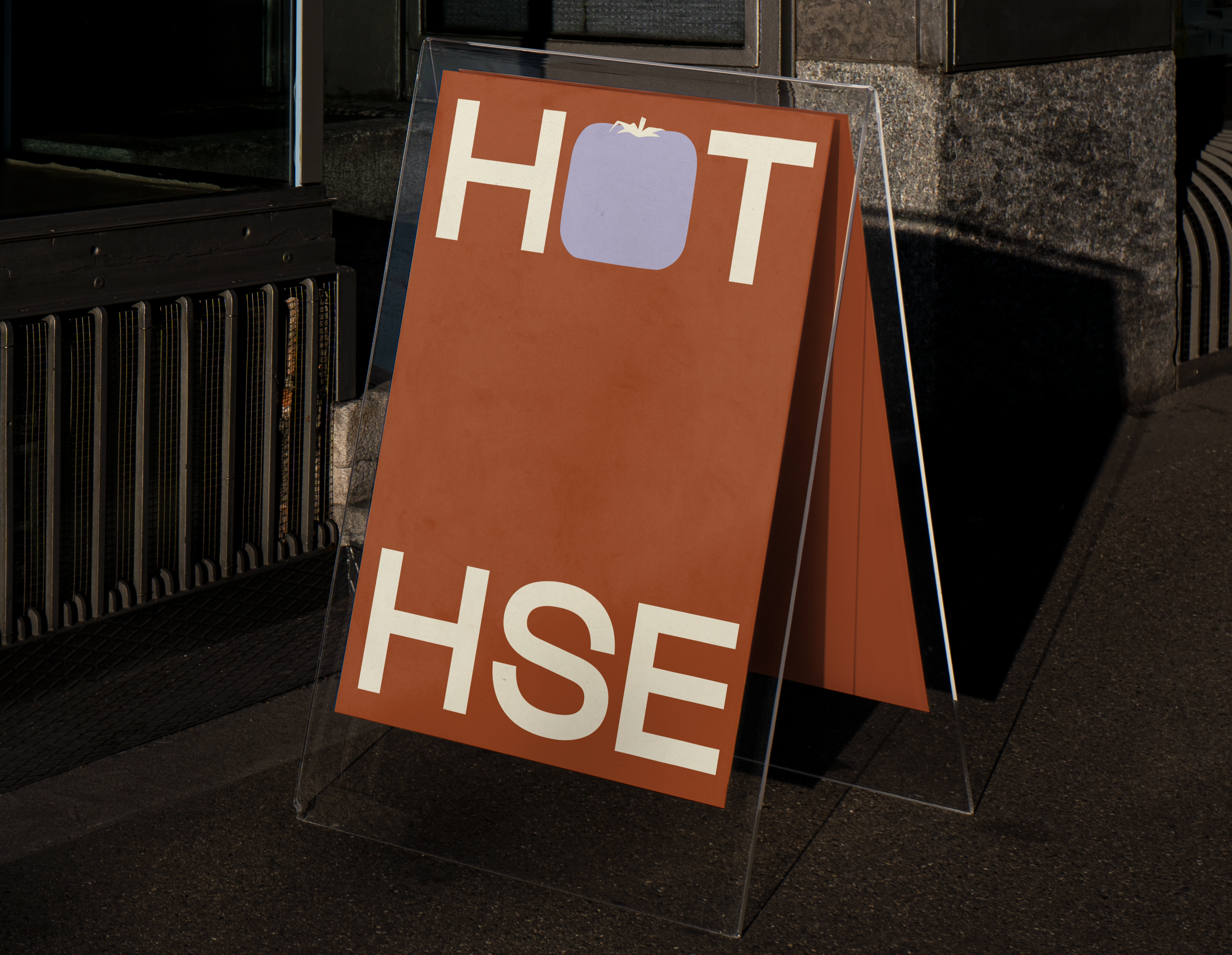


Curated by myself and Carl Durkow, Hothouse is a concept shop that markets distinctive wares and home decor made by Philadelphia artists. In creating the overall brand, we wanted something that felt playful and somewhat open ended, as we intend to shift what we do over time. We wanted an interplay with the word "hothouse"- so I chose to use a tomato flattened inside a house as a main branding element. More @hothouse.fun
Photography: Tom Scanlan and Zach Sayles
Photography: Tom Scanlan and Zach Sayles
.
Bill Viola
Exhibition, Branding
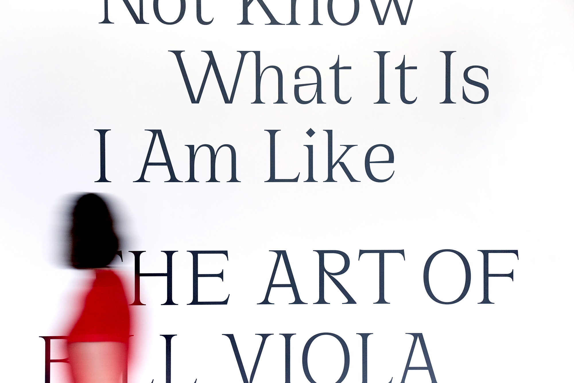

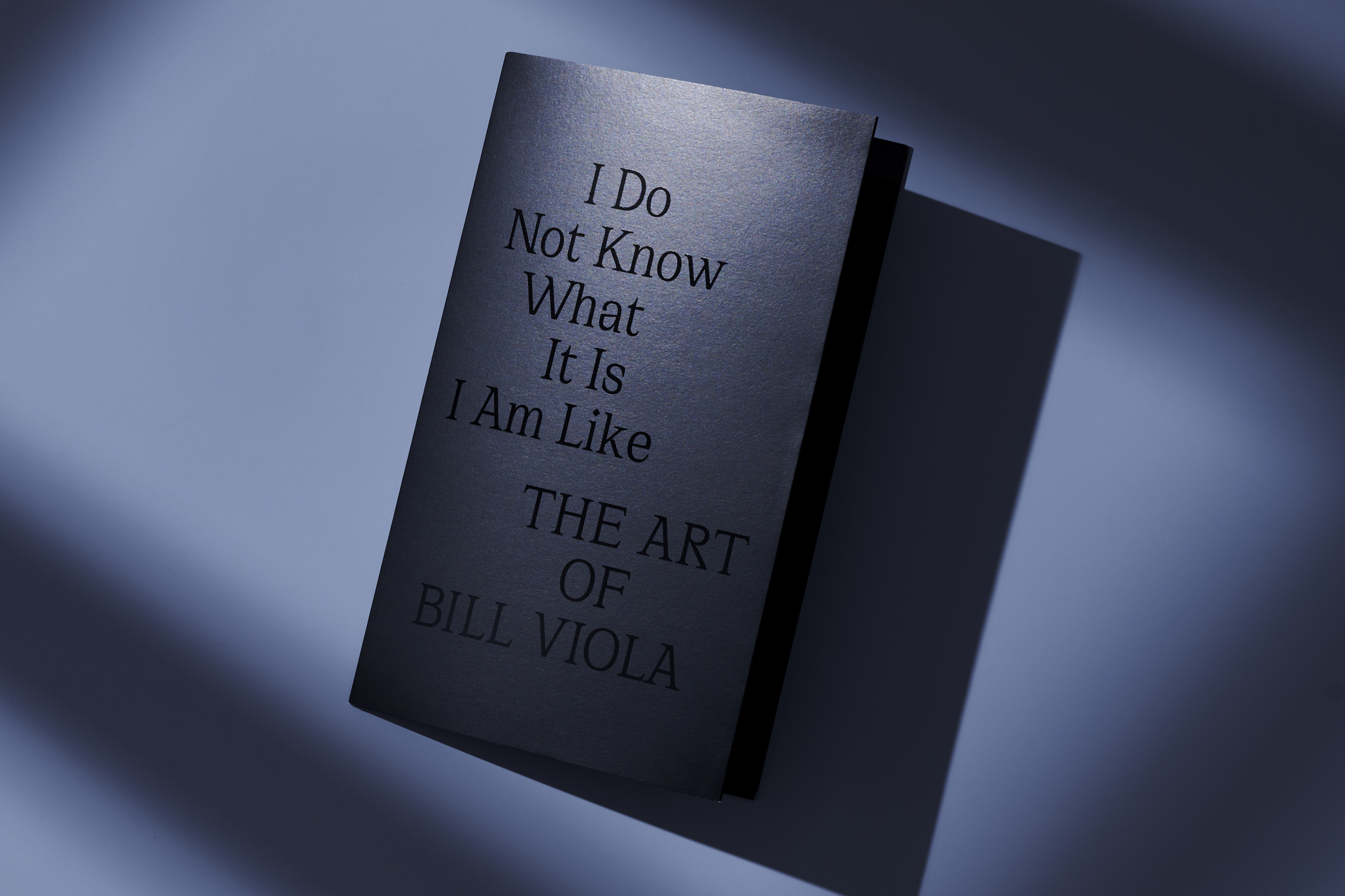
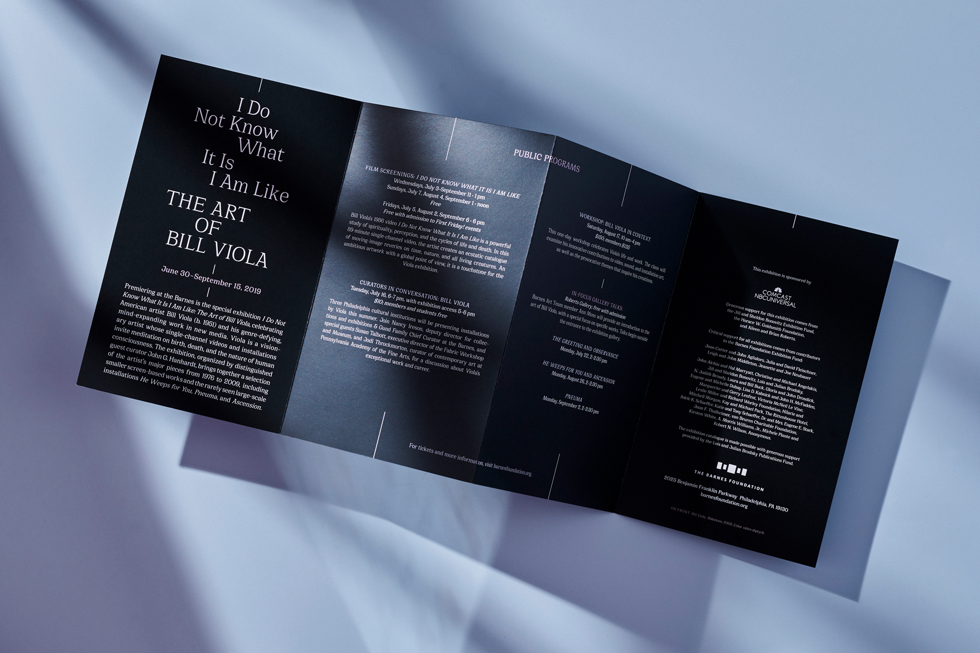

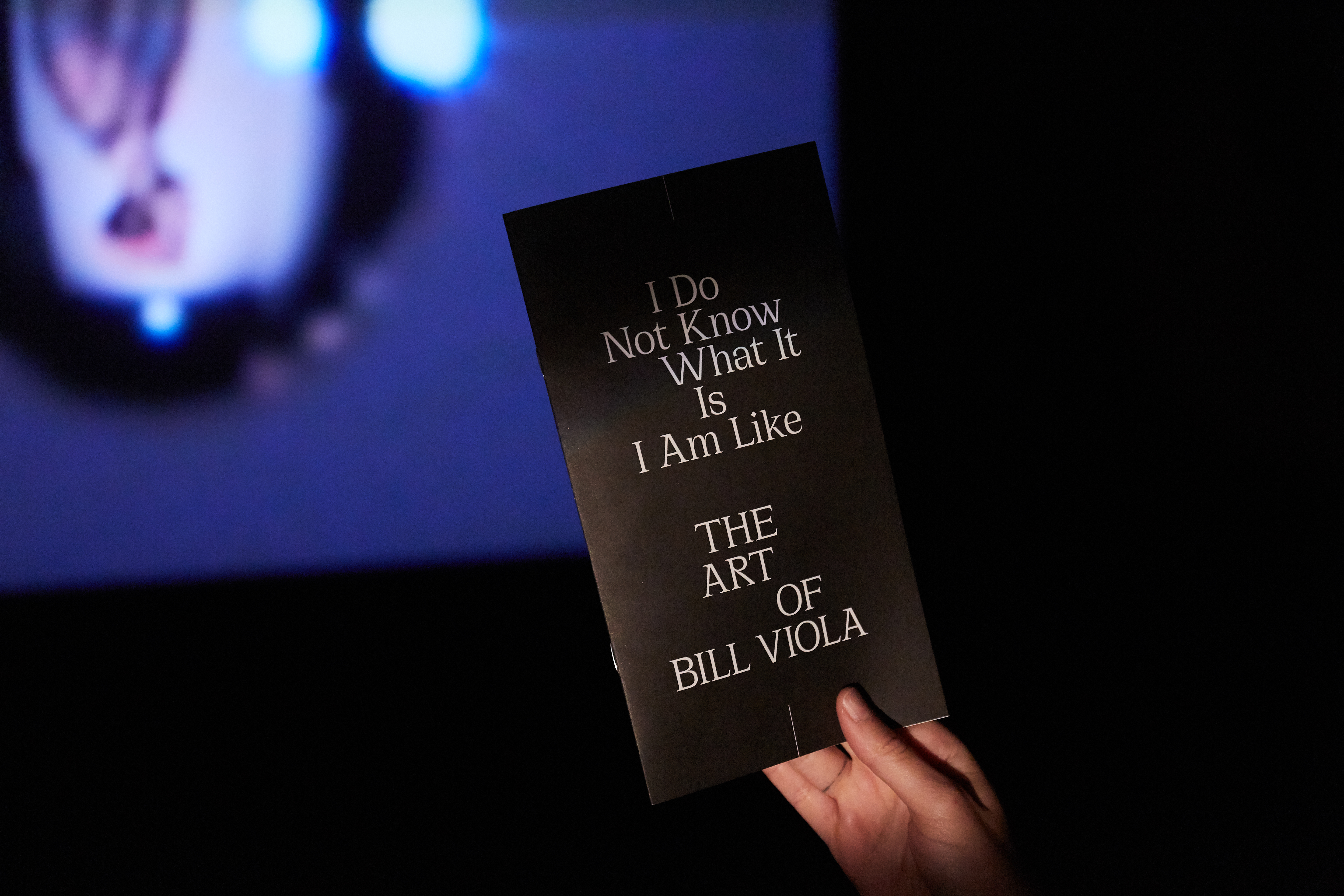


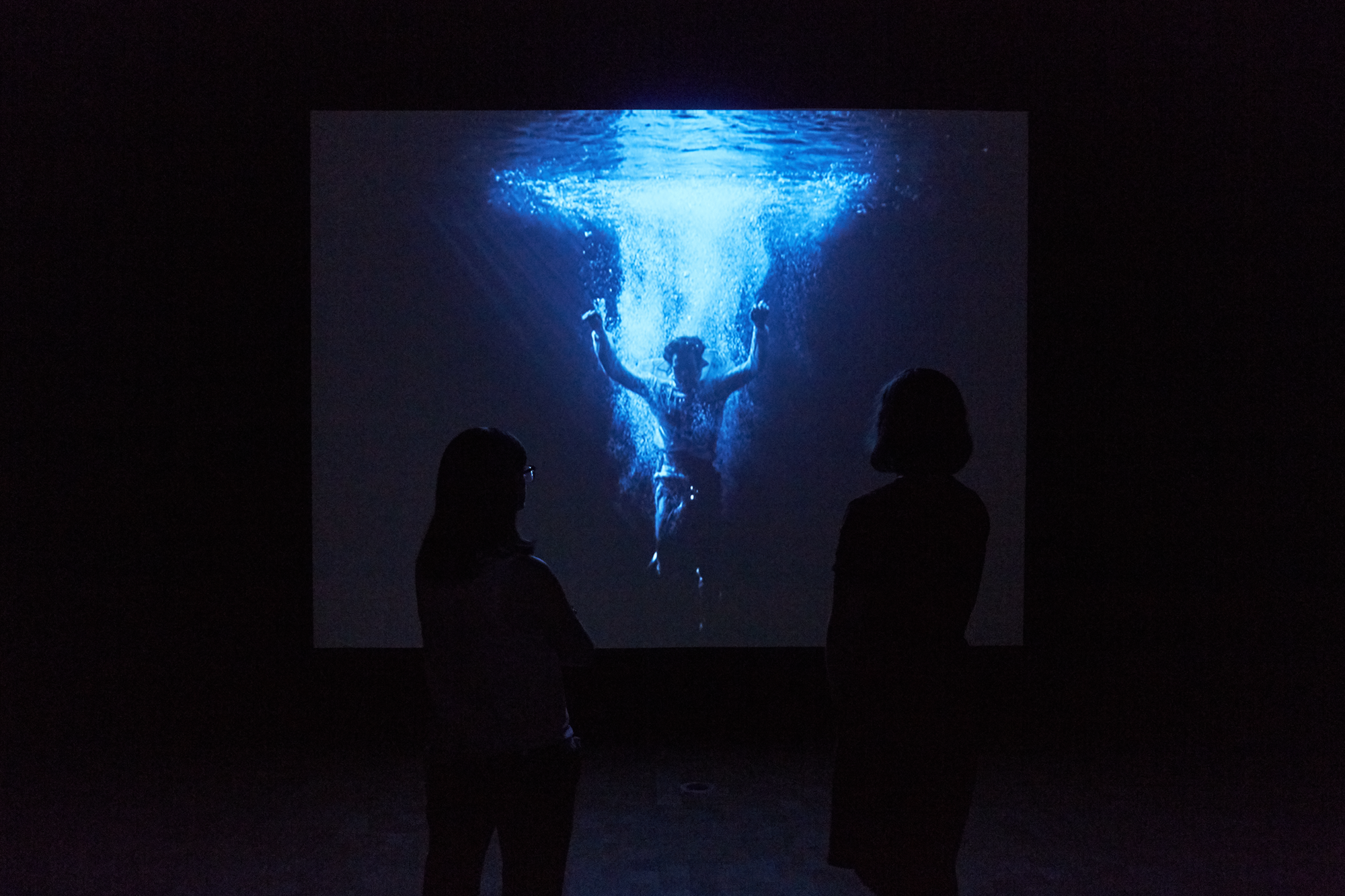
Exhibition identity, brochure, and invitation for I Do Not Know What It Is I Am Like The Art of Bill Viola at the Barnes Foundation.
American artist Bill Viola (b. 1951) is renowned for his genre-defying work in new media. His installations feature moving images that invite meditations on birth, death, spiritual themes, and the nature of human consciousness.
Viola's works frequently feature strongly centered compositions, which we chose to mirror in the exhibition identity. The invitation features black spot UV ink on matte-coated black stock, evoking Viola's art's quiet, dark nature. Exhibition wall texts were executed through silk-screen printing directly to the wall and cut vinyl application.
Art Direction: Olivia Verdugo
Exhibition Photography: Sean Murray
Flat Photography: Ian Shiver
.
Soutine/ de Kooning
Branding, Exhibition graphics
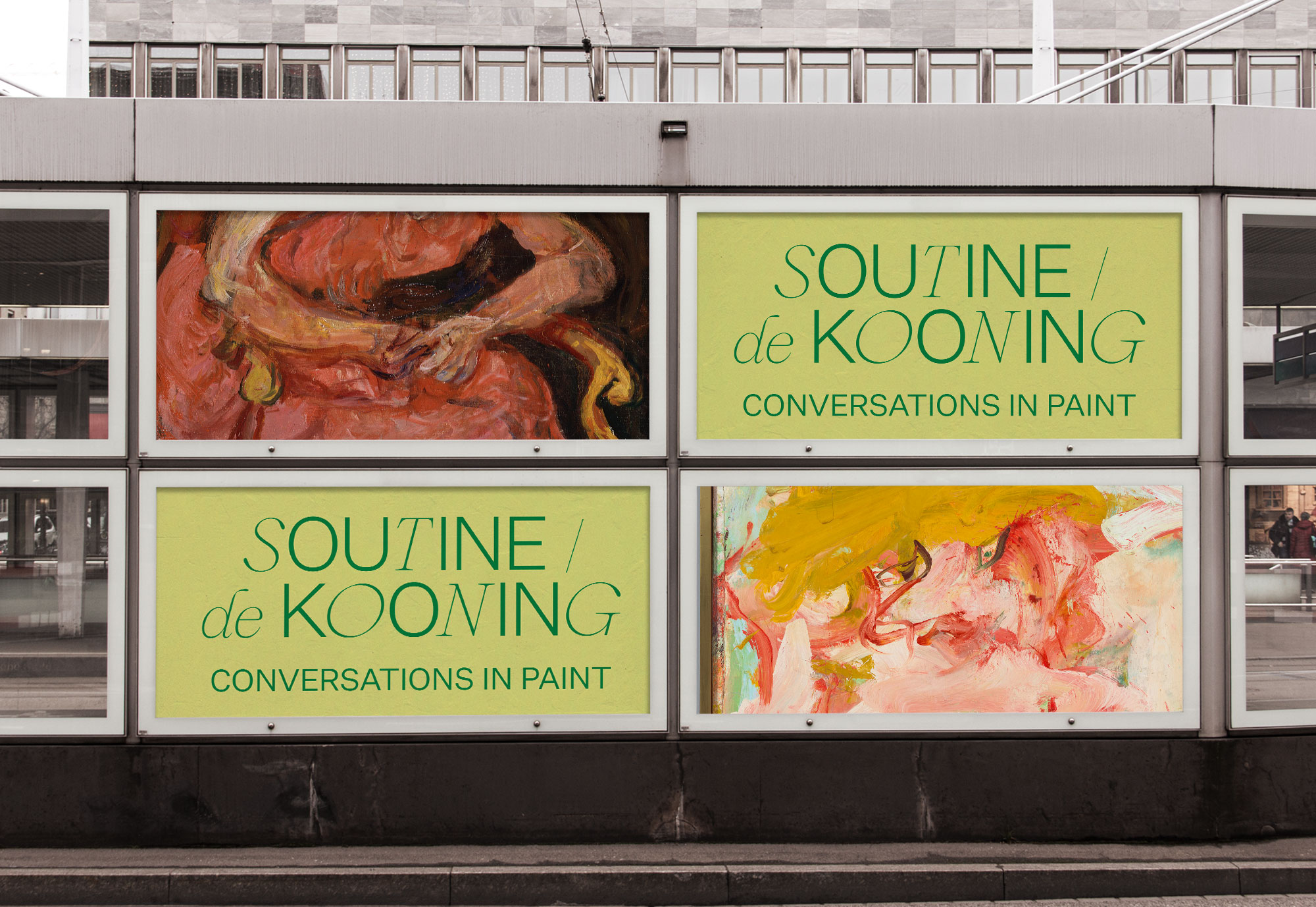
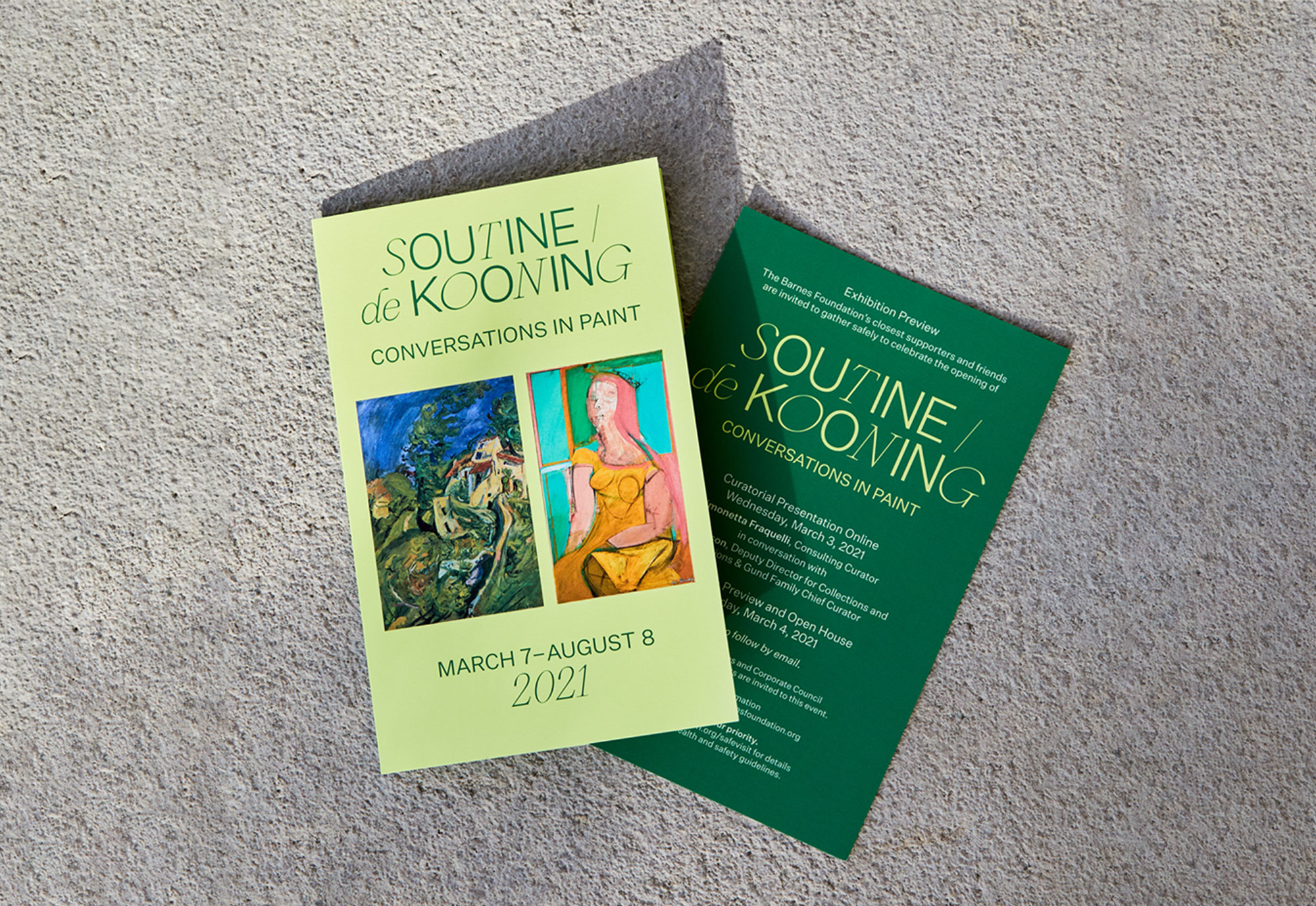
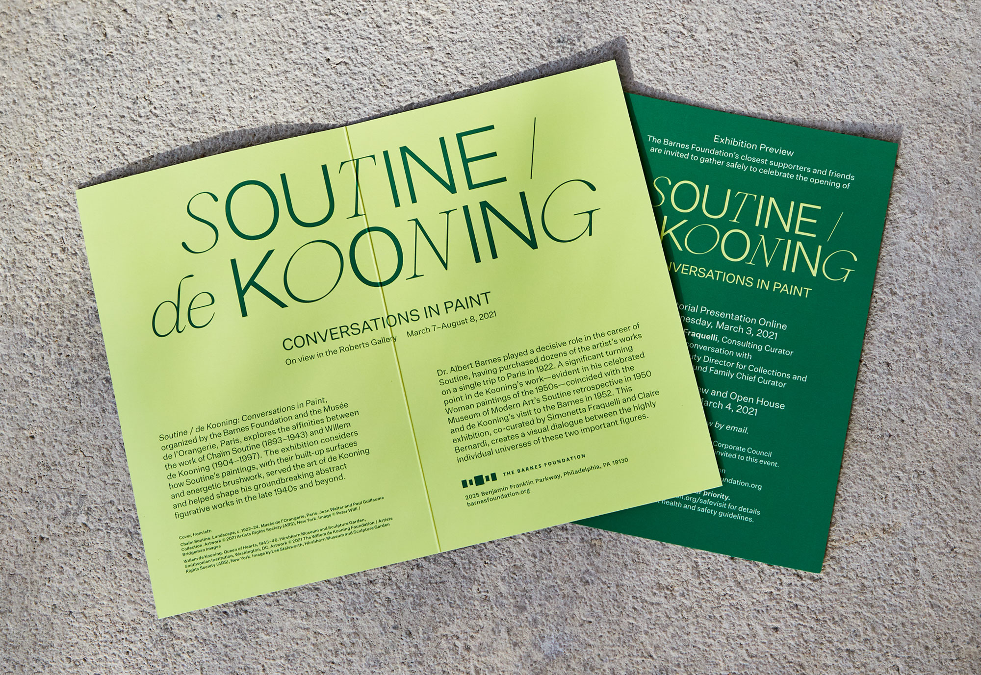
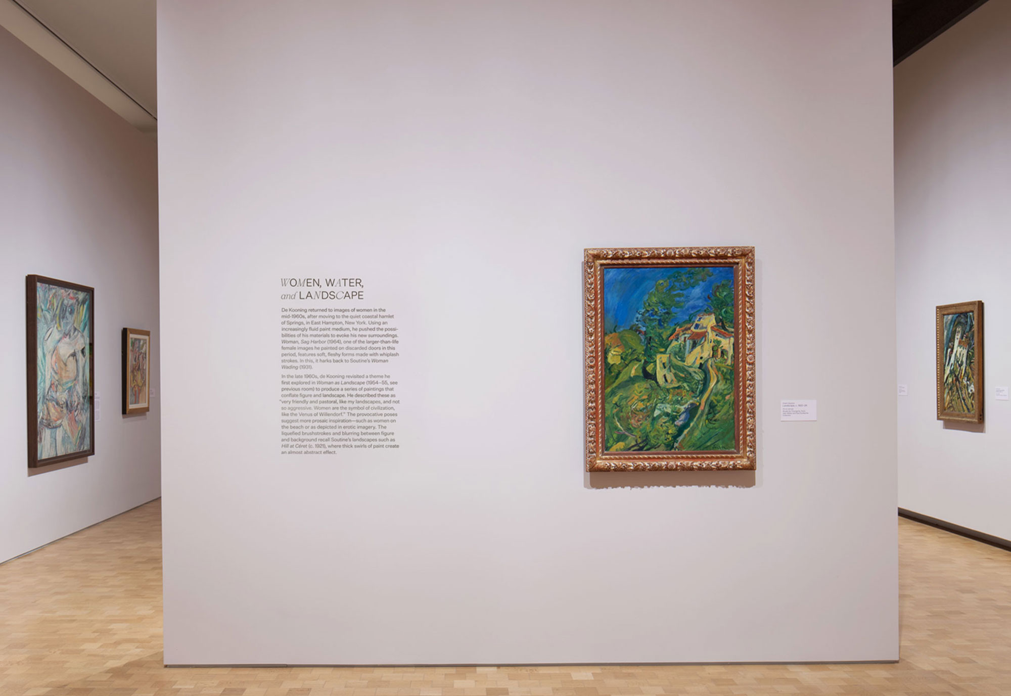
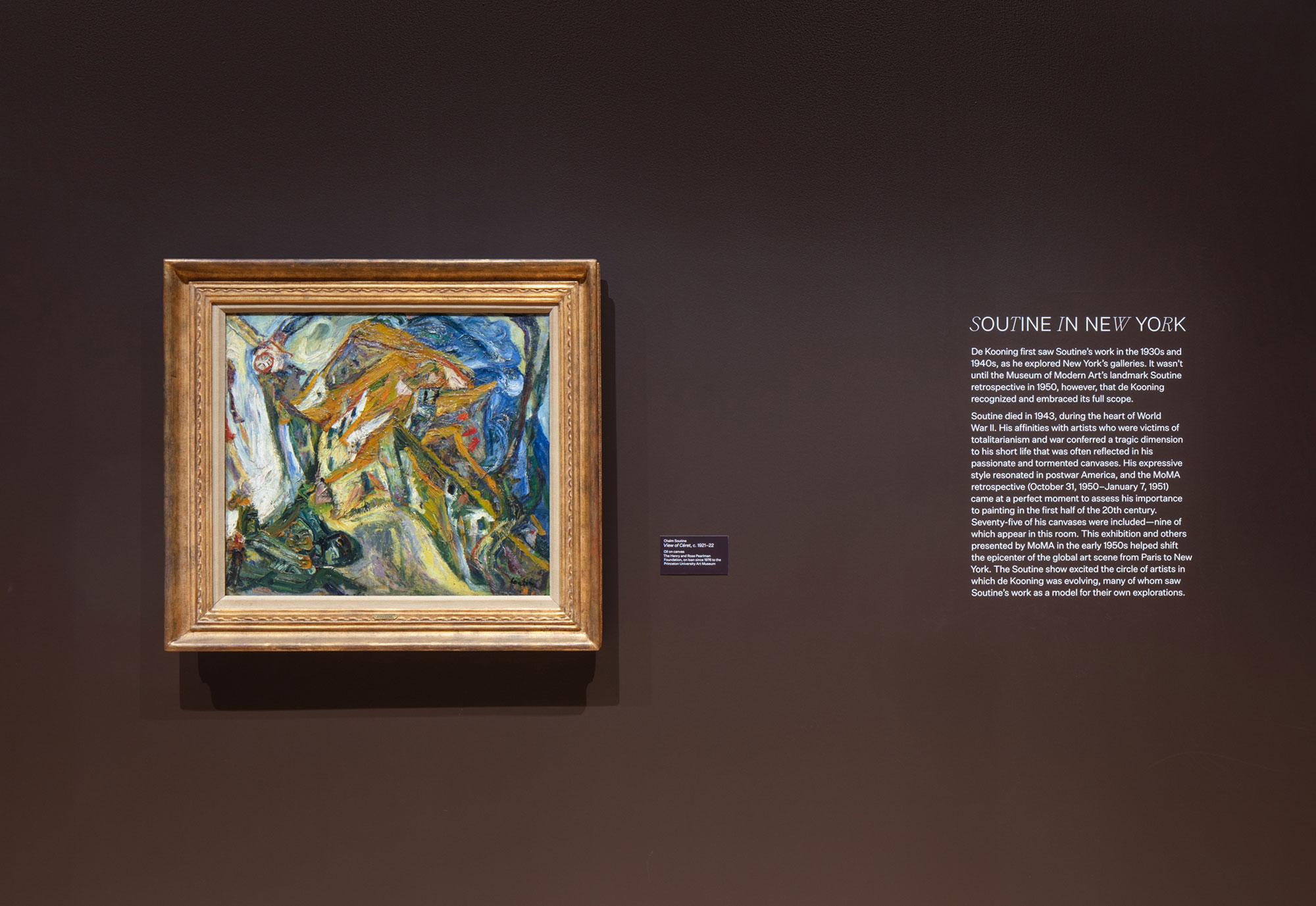
Soutine / de Kooning: Conversations in Paint, organized by the Barnes and the Musées d’Orsay et de l’Orangerie, Paris, presents nearly 45 works by these titans of 20th-century art. The exhibition considers how Soutine’s paintings, with their built-up surfaces and energetic brushwork, served the art of de Kooning, shaping his groundbreaking figurative/abstract works in the late 1940s and beyond.
Art Direction: Olivia Verdugo
Photography: Alexander Rotundo and Colleen Hankerson
Curation: Simonetta Fraquelli and Claire Bernardi
Typefaces: Sometimes Times by Boulevard Lab and Untitled Sans by Klim Type Foundry
Art Direction: Olivia Verdugo
Photography: Alexander Rotundo and Colleen Hankerson
Curation: Simonetta Fraquelli and Claire Bernardi
Typefaces: Sometimes Times by Boulevard Lab and Untitled Sans by Klim Type Foundry
.
Carl Durkow Candle Packaging
Identity, Package Design


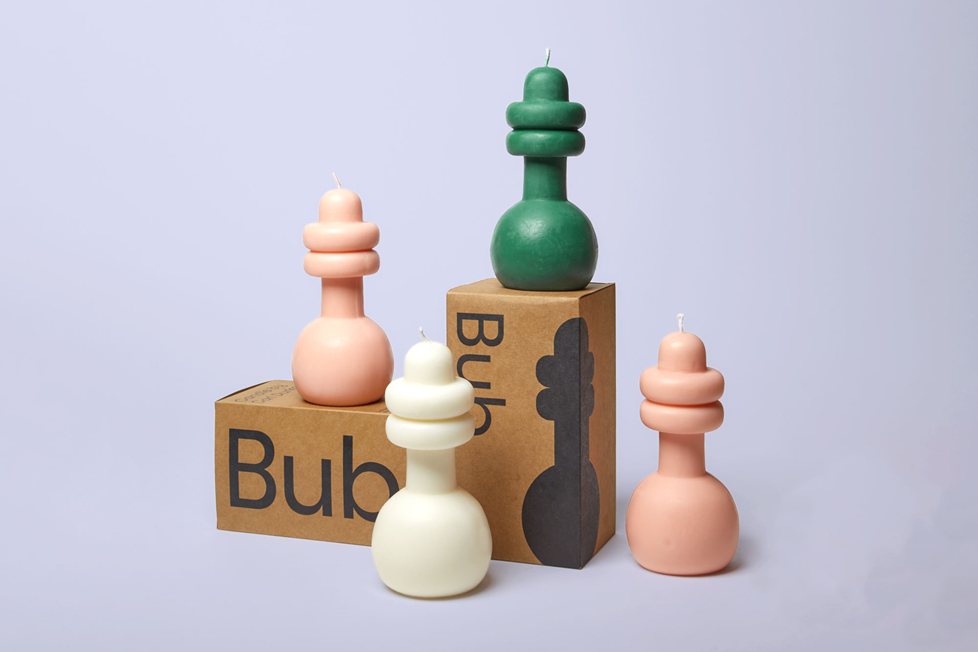
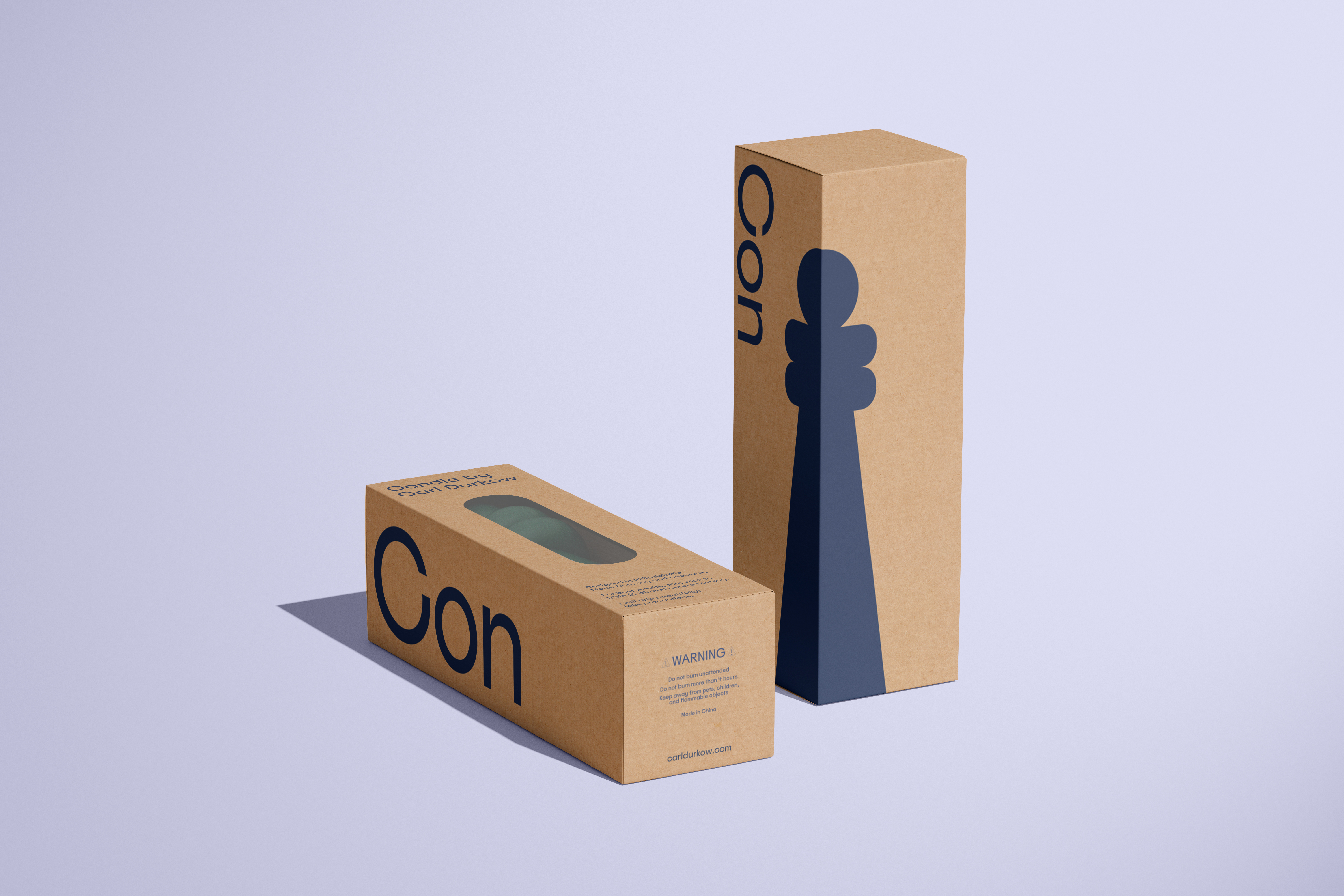
Candle packaging for designer Carl Durkow. The design is printed on a kraft paper box with a clear oval window to reveal the color of the candle inside. The candle shape wrapping around the edge of the box is meant to create interesting displays in a retail setting.
Photography: Tom Scanlan
Photography: Tom Scanlan
.
Marie Cuttoli
Exhibition branding, Print design


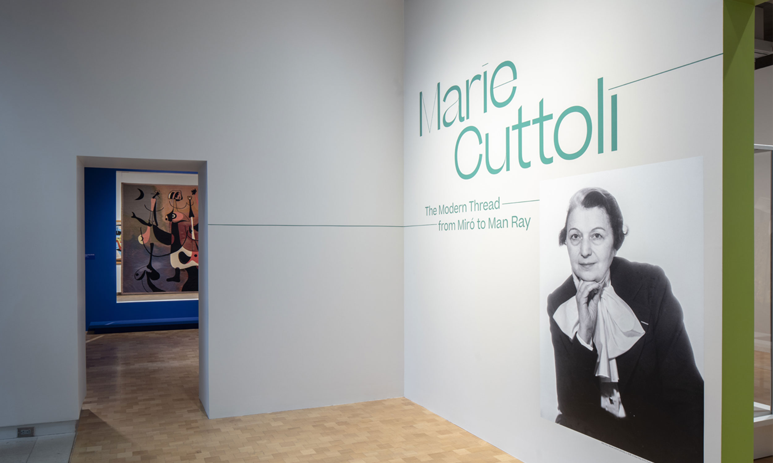

Branding for Marie Cuttoli: The Modern Thread from Miró to Man Ray.
Art Direction: Olivia Verdugo and Pauline Nyren
Art Direction: Olivia Verdugo and Pauline Nyren
.
Barnes Art Ball 2019
Branding, Print Design
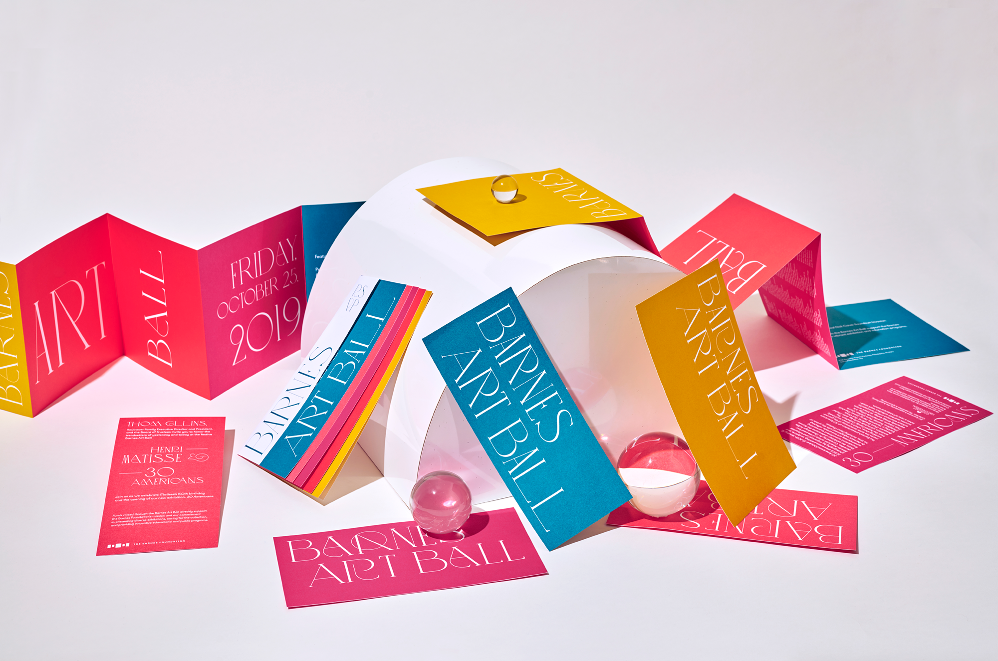


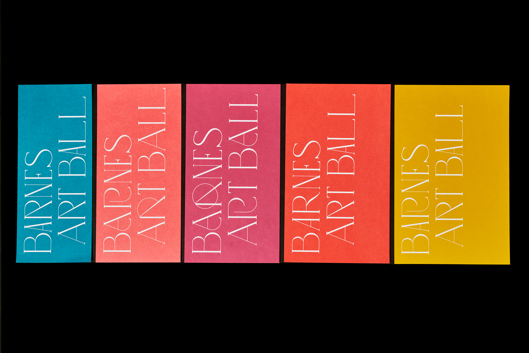

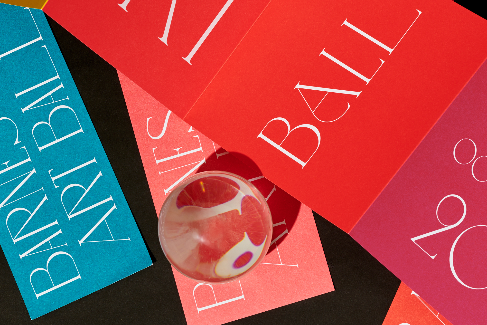
This invitation and program were for Barnes Art Ball, a large donor event at the Barnes Foundation. It was designed to feel luxe and vibrant, to stir up some excitement around the event. Art Ball was themed around Matisse's 150th birthday and the opening of the exhibition, 30 Americans. Restrictions surrounding Matisse iconography drew us to a solution of focusing on color and typography in this piece rather than shapes or imagery. The thin lines hint at the delicate linework in archival Matisse drawings. The color palette was drawn from Matisse paintings within the Barnes collection. As the invitation unfolds, you're introduced to each new vibrant color, and new glyphs in the typeface, "LOVE."

